How I Took My Portfolio From 77 to 100 on Lighthouse

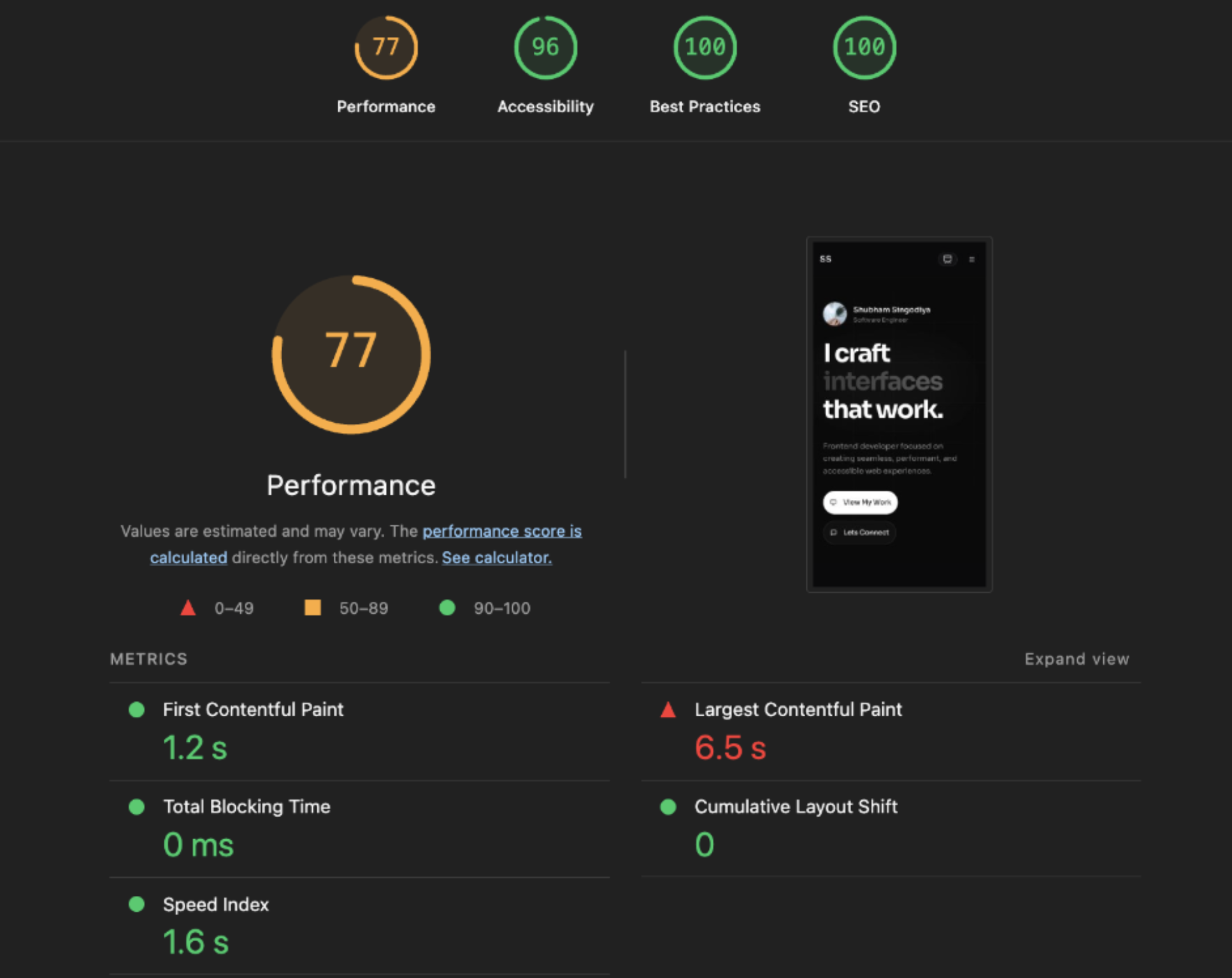
I recently ran a Lighthouse audit on my portfolio and the results were humbling. Accessibility, Best Practices, SEO, all great. But Performance? 77 out of 100. The biggest red flag was a Largest Contentful Paint (LCP) of 6.5 seconds. That's embarrassingly slow for what is essentially a static portfolio site.
So I dug in. What I found wasn't a single catastrophic bug, it was a collection of very common frontend mistakes that compound into a slow experience. After fixing everything, I hit a perfect 100 across the board.
Here's exactly what was wrong and how I fixed each issue. No vague tips, just actual code, actual tradeoffs, actual reasoning.
Understanding What Lighthouse Actually Measures
Before jumping into fixes, it's worth understanding what the numbers mean. Lighthouse evaluates your page through Core Web Vitals, real metrics that reflect how a user experiences your page:
- LCP (Largest Contentful Paint): When does the biggest visible element finish rendering? Target: under 2.5 seconds.
- FCP (First Contentful Paint): When does anything first appear on screen? Even a single line of text counts.
- TBT (Total Blocking Time): How long does JavaScript lock up the main thread, making the page feel frozen?
- CLS (Cumulative Layout Shift): Do things jump around while loading? That jittery experience where a button moves right as you try to click it.
- Speed Index: How quickly does the viewport visually fill in?
My FCP, TBT, CLS, and Speed Index were all green. The sole culprit was LCP at 6.5s, more than double the "poor" threshold. Fixing this one metric was the key to everything.
Problem 1: State-Gated Rendering Is an LCP Killer
This was the single biggest hit to performance, and it's a pattern I see everywhere in React codebases.
My hero section had an entrance animation. To make the text fade in after the page loads, I used a common React pattern:
const [mounted, setMounted] = useState(false)

useEffect(() => {
  setMounted(true)
}, [])

// In the JSX:
<span className={mounted ? "opacity-100" : "opacity-0"}>
  I craft interfaces that work.
</span>
Looks harmless. It's actually catastrophic for LCP, and here's exactly why.
The Hydration Timeline
In a Next.js app, the server renders your component into HTML and sends it to the browser. The browser paints this HTML immediately, and this is what makes SSR fast. But this HTML is dead. It has no event listeners, no state, no interactivity.
Hydration is the process where React runs on the client, walks through the existing DOM, and "wakes it up" by attaching onClick handlers, initializing useState, and making everything interactive.
Here's the critical timing issue:
Server sends HTML → Browser paints it (hero text is opacity: 0)
                  → Browser downloads JS bundle
                  → React hydrates the page
                  → useEffect fires → setMounted(true)
                  → React re-renders → opacity becomes 1
                  → Browser finally paints the LCP element ❌
The browser sees the hero text in the DOM from the very first frame. But because it's at opacity: 0, it doesn't count as a "contentful paint." The browser waits. React hydrates. useEffect fires. State updates. Re-render happens. And only then does the text become visible and LCP gets recorded.
That entire sequence (download JS, parse, hydrate, effect, re-render) took 980ms on my page. Almost a full second of delay, just because I wanted a fade-in animation.
The Fix: CSS Animations Replace JS State
The solution is to let CSS handle the entrance animation entirely. No JavaScript involvement during the critical paint path:
/* globals.css - extracted at build time, available before JS loads */
@keyframes hero-fade-up {
  from { opacity: 0; transform: translateY(1rem); }
  to   { opacity: 1; transform: translateY(0); }
}

.hero-fade-up {
  animation: hero-fade-up 0.7s ease-out both;
}
// No mounted state, no useEffect
<span
  className="hero-fade-up"
  style={{ animationDelay: "100ms" }}
>
  I craft interfaces that work.
</span>
The element is in the HTML from the server. The CSS animation is in the stylesheet, loaded before any JS runs. The browser can paint it immediately, the animation plays from CSS alone, and LCP drops from 6.5s to under 1.2s.
The key insight: animation-fill-mode: both (the both keyword in the shorthand) applies the from state during the delay period and preserves the to state after the animation finishes. So the element starts invisible via CSS, not JavaScript, and stays visible after the animation without needing any state.
Takeaway: Never gate above-the-fold content behind useEffect or useState. If you need entrance animations, use CSS @keyframes with animation-delay. The browser doesn't need React to play an animation.
Problem 2: Nuking the Image Optimization Pipeline
My next.config.mjs had this:
const nextConfig = {
  images: {
    unoptimized: true,
  },
}
One line. It was responsible for 881 KiB of wasted bandwidth on every page load.
What This Flag Actually Does
Next.js has a built-in image optimization server. When you use the <Image> component, it doesn't simply render an <img> tag pointing to your file. It rewrites the src to /_next/image?url=...&w=640&q=75, an API route that receives the image request, runs it through the sharp library, and serves an optimized version.
The pipeline does five things:
1. Re-encodes to modern formats (WebP, AVIF)
JPEG and PNG are legacy formats. WebP delivers 25-35% smaller files with equivalent quality. AVIF pushes that to 50% or more. If you were doing this manually in a vanilla HTML project, you'd use a build script:
const sharp = require('sharp')
sharp('hero-image.png')
  .webp({ quality: 80 })
  .toFile('hero-image.webp')
Next.js negotiates this automatically via the Accept header. If the browser supports AVIF, it gets AVIF. If it supports WebP, it gets WebP. Otherwise, the original format.
2. Resizes to the actual display size
My profile avatar was displayed at 56×56 pixels. The source file, master-logo.png, was 640×640 pixels and weighed 393 KiB. That's a 56px circle on screen receiving a 640px image. For retina screens, you'd want 2x, so 112×112 pixels. A WebP at that size is about 5 KiB. That's a 98.7% reduction.
3. Generates a responsive srcset
Different devices need different image sizes. A phone with a 375px viewport doesn't need the same 1200px-wide hero image that a desktop monitor does. In plain HTML, you'd write the srcset manually:
<img
  src="/photo-800.webp"
  srcset="
    /photo-400.webp  400w,
    /photo-800.webp  800w,
    /photo-1200.webp 1200w
  "
  sizes="(max-width: 768px) 100vw, 50vw"
  alt="Hero photo"
/>
The browser reads sizes ("this image takes up 100% of the viewport on mobile, 50% on desktop"), looks at the srcset, considers the device pixel ratio, and picks the smallest image that will look sharp.
Next.js generates the srcset for you using the widths in the images.deviceSizes and images.imageSizes config. But you still need to provide the sizes prop because without it, Next.js defaults to assuming the image is 100vw wide.
4. Lazy loading
Images below the fold don't need to load immediately. The native HTML attribute loading="lazy" tells the browser to defer fetching the image until it's approximately one viewport away from being visible. Next.js adds this to every <Image> by default (unless you set priority).
5. CLS prevention
When an image loads without known dimensions, the browser doesn't know how tall it will be. The surrounding content shifts down once the image arrives, and this is Cumulative Layout Shift. Next.js prevents this by always rendering the image container with the correct aspect ratio, either through explicit width/height props or the fill prop within a positioned parent.
So What About priority and Prefetch?
For above-the-fold images that you want to load immediately, Next.js provides the priority prop:
<Image
  src="/hero-banner.webp"
  alt="Hero"
  width={1200}
  height={600}
  priority  // Adds <link rel="preload"> in the document head
/>
This tells the browser: "Fetch this image before anything else." It injects a <link rel="preload"> tag in the <head>, giving the image priority in the network queue. Use it for the LCP image and nothing else, because if you preload everything, you preload nothing.
The One-Line Fix
const nextConfig = {
  images: {
    formats: ['image/avif', 'image/webp'],
  },
}
Remove unoptimized: true. That's it. The entire optimization pipeline comes alive.
I also added sizes props to all my <Image> components so the browser always knows the correct size to request:
<Image
  src="/master-logo.png"
  alt="Profile"
  fill
  sizes="56px"          // Exact display width, no ambiguity
  className="object-cover"
  priority
/>
I also had raw <img> tags in my articles section for blog thumbnails. Those bypass the entire optimization pipeline. Switching to <Image> with proper sizes gave me automatic format conversion, lazy loading, and CLS prevention for free:
// Before: raw HTML, no optimization
<img src={article.image} alt={article.title} />

// After: full optimization pipeline
<Image
  src={article.image}
  alt={article.title}
  fill
  sizes="(max-width: 768px) 100vw, (max-width: 1200px) 50vw, 33vw"
  loading="lazy"
/>
Problem 3: Runtime CSS Injection With <style jsx>
My hero section had all its keyframe animations inside a <style jsx> block:
<style jsx>{`
  @keyframes shimmer { ... }
  @keyframes flip-text { ... }
  @keyframes glow-shift { ... }
`}</style>
This looks convenient but it's architecturally flawed.
How CSS Gets to the Browser: Two Paths
Path 1: Build-time extraction (good)
CSS written in globals.css, CSS Modules, or Tailwind utility classes gets processed by the bundler at build time. The output is a static .css file that the browser downloads right alongside the HTML. The CSS exists before any JavaScript runs.
Browser receives HTML → Sees <link href="styles.css"> → Downloads CSS
→ Builds CSSOM → Paints the page
✅ Keyframes are available from the very first frame
Path 2: Runtime injection (problematic)
CSS-in-JS approaches like styled-jsx, styled-components, or Emotion generate CSS at runtime. The browser does this:
Browser receives HTML → Downloads JS → JS executes → styled-jsx injects
a <style> tag into <head> → Browser recalculates styles → Keyframes now exist
❌ Animations can't run until after JavaScript executes
If the JavaScript bundle is large, slow to download, or delayed, there's a window where the page is rendered but the keyframe animations simply don't exist. The browser skips them or elements snap to their final state with no animation.
The Fix
I moved every keyframe from <style jsx> to globals.css:
/* globals.css - always available, no JS dependency */
@keyframes shimmer {
  0%   { background-position: 200% center; }
  100% { background-position: -200% center; }
}

@keyframes flip-text {
  0%   { transform: scale(1) rotateY(0deg); }
  50%  { transform: scale(1.3) rotateY(180deg); }
  100% { transform: scale(1) rotateY(360deg); }
}

.animate-flip-text {
  animation: flip-text 1.2s cubic-bezier(0.4, 0, 0.2, 1) forwards;
  transform-style: preserve-3d;
}
The <style jsx> block and its runtime dependency were completely removed. The CSS now ships as a static file with zero JavaScript overhead for styling.
Problem 4: A 790 KiB Favicon
My layout.tsx had this:
icons: {
  icon: '/master-image-circle.png',  // 790 KiB
}
A 790 KiB favicon. For a 16×16 pixel icon in the browser tab.
Here's the thing about favicons: they're fetched by the browser directly. They don't go through Next.js's <Image> component or the /_next/image optimization API. Whatever file you point to, that's exactly what gets downloaded, full size, original format, no magic.
I resized the image to 32×32 pixels using macOS's built-in sips tool:
sips -z 32 32 master-image-circle.png --out master-favicon-32.png
790 KiB → 2.7 KiB. Same image, 99.7% smaller. The favicon in the browser tab looks identical because it's displayed at 16-32px anyway.
The Results
After all four fixes, Lighthouse gave me a perfect score across the board:
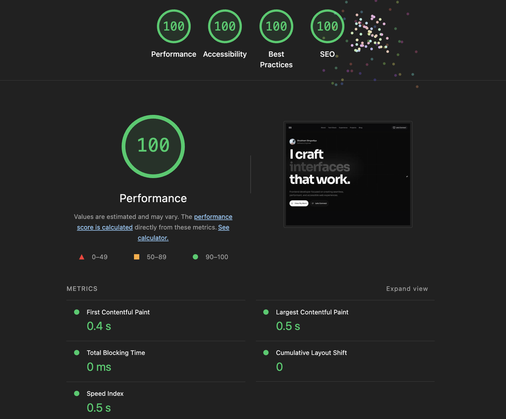
| Metric | Before | After |
|---|---|---|
| Performance | 77 | 100 |
| LCP | 6.5s | ~0.9s |
| Image transfer | ~965 KiB | ~80 KiB |
| Favicon | 790 KiB | 2.7 KiB |
The Broader Lesson
None of these issues were exotic edge cases. They were all incredibly common patterns:
- Using
useState+useEffectfor entrance animations (I see this in almost every React portfolio) - Leaving
unoptimized: truefrom an old static export setup and forgetting to remove it - Using
<img>instead of framework-provided<Image>because it's simpler - CSS-in-JS for styles that have no dynamic component
Performance work isn't usually about finding one smoking gun. It's about noticing a dozen small things that each trim 200ms here, 400 KiB there. They compound. A site that feels "fine" locally over gigabit internet feels sluggish on a 4G phone in a coffee shop.
Run Lighthouse. Read the output. Fix the list. Ship.
If you found this useful or want to discuss frontend performance in more depth, feel free to reach out to me on LinkedIn. Always happy to nerd out over Web Vitals.